
The Flower Color Palettes That Actually Work Together
The Flower Color Palettes That Actually Work Together
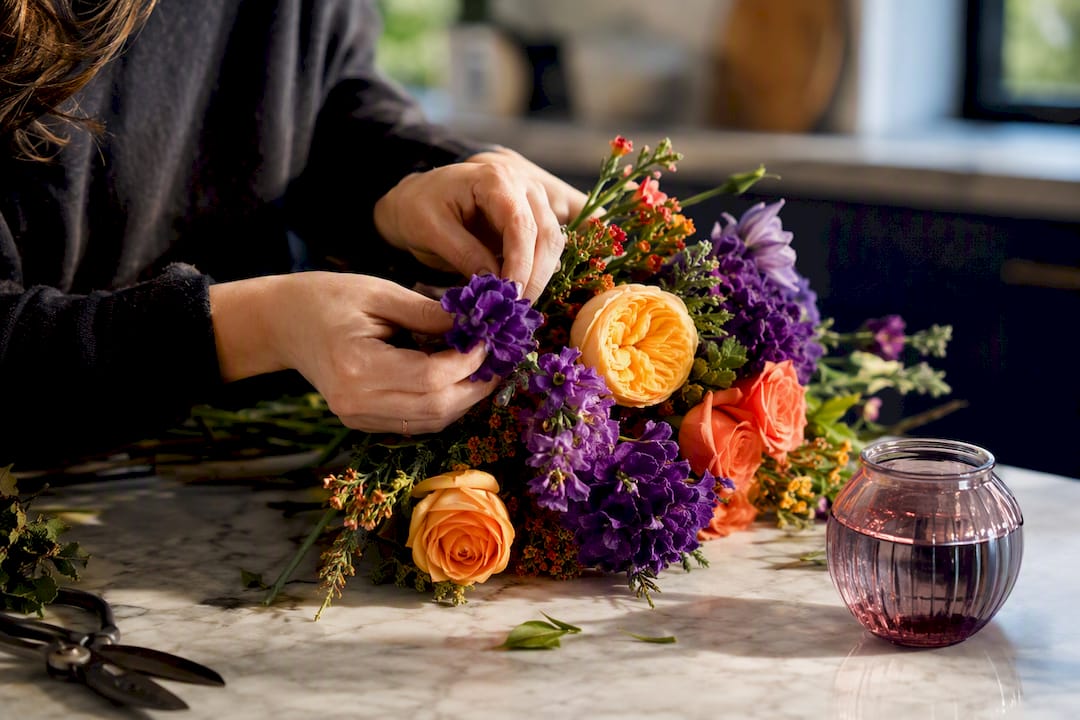
The most reliable flower color palettes follow four frameworks: complementary (opposite hues, like purple and yellow), analogous (neighbors on the wheel, like pink and coral), monochromatic (one hue, multiple values), and temperature-first (all warm or all cool tones, mixed freely within that range). Here are palettes to use today:
- Spring pastels: blush + lilac + sage greenery — bridal bouquets and Easter tables
- Sunset warm: terracotta + marigold + burgundy — fall centerpieces
- Classic complementary: violet purple + golden yellow — high-impact porch containers
- Cool romantic: dusty blue + white + eucalyptus — anniversary arrangements
- Monochrome blush: pale pink to deep rose, one hue three values — minimalist gifts
- Jewel tone: ruby + amethyst + emerald foliage — winter dinner parties
Keep reading for 12 more named palettes, a build-your-own method, and how to adjust any of these for garden beds versus cut-flower vases.
Key Takeaways
Complementary, analogous, and monochromatic frameworks give any flower palette structure, and matching foliage undertone to flower temperature prevents most color clashes before they happen.
| Point | Details |
|---|---|
| Start with one dominant color | Let it cover roughly 60% of the arrangement or bed before adding support tones. |
| Match foliage temperature | Choose blue-green eucalyptus for cool palettes and yellow-green foliage for warm ones. |
| Use the 70/30 balance | Let neutrals or muted tones dominate, reserving full saturation for a smaller accent area. |
| Test under real light | Photograph sample groupings under the actual lighting before ordering or planting at scale. |
| Order a custom palette | Malikflowers builds handcrafted arrangements around any palette, backed by a satisfaction guarantee. |
Table of Contents
- Building Flower Color Palettes That Don’t Clash
- The Color Theory Behind Palettes That Look Intentional
- 18 Flower Color Palettes for Every Season and Mood
- Turning a Palette Into a Garden Bed or a Bouquet
- How Florists Actually Build a Palette by Hand
- Balancing Vibrant Colors With Neutral Tones
- What Flower Colors Symbolize Across Cultures
- Adjusting Palettes for Indoor Light Versus Outdoor Light
- Why Most Palette Advice Skips the Hard Part
- Order a Custom Palette Instead of Guessing Alone
- Sources
- FAQ
Building Flower Color Palettes That Don’t Clash
Pick your context before you pick a color. A palette for a shaded backyard border behaves differently than one for a dining table under warm lightbulbs, so nail down the season, the occasion, and one dominant color before you touch a second hue.
- Choose one dominant color first. This should cover roughly 60% of the visual weight, whether that’s a bed of coral zinnias or a bouquet built around blush garden roses.
- Add one or two secondary tones. Florists generally stick to a two-to-three color framework of dominant plus secondary plus greenery, rather than piling on four or five competing hues.
- Match your foliage to the temperature of the flowers. Warm palettes want yellow-green foliage like ninebark or amaranth; cool palettes want blue-green like eucalyptus or dusty miller.
- Check bloom timing or vase life. A garden palette needs staggered bloom windows so something is always flowering; a bouquet palette needs every stem to hold up for the same 5 to 7 days.
- Run the lighting and context check. Will this sit under fluorescent office lights, get photographed outdoors, or sit next to a specific dress or tablecloth color?
Pro Tip: Snap a phone photo of your two or three candidate colors together before you order anything. Screens exaggerate saturation differently than daylight does, so a quick photo test catches a clash before it costs you a wasted arrangement.
The Color Theory Behind Palettes That Look Intentional
A palette looks accidental when it ignores the color wheel; it looks designed when it uses one of four core harmonies deliberately, which is why florist education resources built around an 18-spoke color wheel treat it as a foundational tool rather than an optional extra.
- Complementary: opposite colors (red/green, purple/yellow) create the highest contrast and the most energy.
- Analogous: neighboring colors (orange, coral, pink) create a soft, cohesive gradient with almost no risk of clashing.
- Triadic: three colors spaced evenly around the wheel (think primary red, yellow, blue) for a bold but balanced look.
- Monochromatic: one hue across light, medium, and dark values, which reads as sophisticated rather than boring.
Temperature matters as much as hue. Warm tones (red, orange, yellow) advance and feel energetic; cool tones (blue, purple, green) recede and feel calm, and mixing the two without a bridge color is the single most common cause of a “muddy” arrangement. Value and saturation are your depth controls: educational guides on flower color methods point out that a paler, less saturated version of your accent color softens a bold pairing without changing the palette itself.
The theory has real dollars behind it. A peer-reviewed horticulture study found that shoppers preferred complementary color combinations in container plantings over randomly associated ones, and complementary arrangements commanded a perceived-value premium of $13 in that study. If you want an arrangement to read as expensive, complementary is your default.
18 Flower Color Palettes for Every Season and Mood
Each palette below lists a dominant color, one or two support tones, an accent, and sample flowers that reliably come in those shades.
Spring Palettes
- Whispers of Spring: blush dominant, lilac support, sage greenery. Sample flowers: garden roses, ranunculus, lilac stems, eucalyptus; best for bridal bouquets and baby showers.
- Citrus Morning: soft yellow dominant, white support, fresh green accent. Sample flowers: daffodils, freesia, ranunculus. Best for brunch tables.
- Cherry Blossom: pale pink dominant, cream support, dusty green accent. Sample flowers: tulips, cherry blossom branches, sweet peas. Best for Mother’s Day gifts.
- Periwinkle Pastel: soft blue-purple dominant, white support, silvery foliage. Sample flowers: hyacinth, muscari, anemones. Best for Easter arrangements.
Summer Palettes
- Sunny Citrus: marigold dominant, coral support, lime greenery. Sample flowers: sunflowers, zinnias, marigolds. Best for outdoor patio decor.
- Cool Romantic: dusty blue dominant, white support, eucalyptus accent. Sample flowers: delphinium, hydrangea, white roses. Best for summer anniversaries.
- Ruby Romance: deep red dominant, blush support, dark greenery. Sample flowers: red roses, ranunculus, garden greens. Best for date-night bouquets.
- Tropical Punch: hot pink dominant, orange support, deep green accent. Sample flowers: gerbera daisies, ginger, tropical foliage. Best for birthday celebrations.
Fall Palettes
- Autumn Glow: terracotta dominant, mustard support, burgundy accent. Sample flowers: dahlias, chrysanthemums, celosia. Best for Thanksgiving tables.
- Harvest Warmth: deep orange dominant, cream support, brown accent. Sample flowers: marigolds, wheat stems, sunflowers. Best for autumn housewarming gifts.
- Wine and Amber: burgundy dominant, gold support, dark foliage. Sample flowers: dahlias, roses, hypericum berries. Best for fall weddings.
- Pumpkin Patch: rust orange dominant, cream support, sage greenery. Sample flowers: ranunculus, mums, eucalyptus. Best for October gatherings.
Winter Palettes
- Jewel Box: amethyst purple dominant, ruby support, emerald greenery. Sample flowers: purple lisianthus, red roses, holly. Best for holiday dinner parties.
- Frosted White: white dominant, silver support, blue-green foliage. Sample flowers: white roses, ranunculus, silver dollar eucalyptus. Best for winter weddings.
- Deep Plum: plum dominant, blush support, dark green accent. Sample flowers: dahlias, garden roses, seeded eucalyptus. Best for New Year’s Eve arrangements.
Neutral and High-Contrast Palettes
- Modern Neutral: ivory dominant, taupe support, sage accent. Sample flowers: ranunculus, spray roses, dried grasses. Best for minimalist home decor.
- Blush and Stone: dusty rose dominant, gray-green support, cream accent. Sample flowers: garden roses, astrantia, dusty miller. Best for understated sympathy arrangements.
- Black and White Bold: white dominant, near-black burgundy accent, no midtone. Sample flowers: white anemones, black baccara roses, dark scabiosa. Best for dramatic modern centerpieces.
Turning a Palette Into a Garden Bed or a Bouquet
A garden and a bouquet use the same palette differently. In a bed, repeat your dominant color in drifts of at least three to five plants rather than scattering single specimens, layer your support tones behind or beside it, and stagger varieties so bloom succession keeps color going from the first tulip to the last aster. Extension research on container gardening color choices recommends selecting foliage and varieties that reliably perform in your climate zone before locking in a color-driven plan.
In a bouquet, start with a focal flower, since wedding-industry color guidance notes that professional florists build around one anchor bloom, then add complementary or analogous support stems, then bridge everything with greenery in a matching undertone. Vary stem size and flower value (light versus dark) so the eye has somewhere to travel instead of landing on one flat block of color.
Two common problems have simple fixes:
- Muddy mix: too many competing hues at similar saturation. Drop one color entirely, or mute one of the remaining two with a paler tint.
- Flat monochrome: one color, one value. Add a much lighter or much darker version of the same hue, or introduce a textured neutral like dried grass or seeded eucalyptus.
Pro Tip: If a palette still feels off after adjusting the flowers, change the foliage undertone instead. Swapping blue-green eucalyptus for yellow-green ninebark can rescue an otherwise correct color combination.
How Florists Actually Build a Palette by Hand
Professional designers don’t start with flowers. They start with foliage, treating greenery as a full color in the palette rather than filler, which is standard advice in university extension guidance on color-driven plantings. A eucalyptus with blue undertones supports a cool palette; ninebark or copper beech supports a warm one.
The working sequence looks like this: pick an anchor flower, select two support tones that share its temperature, add one textural element (something spiky, something airy, something round), then choose greenery last so it bridges rather than fights the palette.
Rules are a guide, not a prison. Some of the most memorable arrangements come from testing a color-wheel-approved palette first, then deliberately breaking one rule once you understand why it exists.
Malikflowers applies this same inside-out method across its custom-design work, building signature collections like Whispers of Spring and Ruby Romance around a single anchor tone rather than a grab bag of favorite colors, and backing every custom order with a satisfaction guarantee if the finished palette doesn’t land the way the client expected.
Balancing Vibrant Colors With Neutral Tones
A palette built entirely from saturated, high-chroma colors tends to fight itself. Two hot pinks and an orange sitting at full saturation compete for attention instead of creating a hierarchy, which is why almost every palette in the catalog above pairs one vibrant hue with a muted or neutral partner.
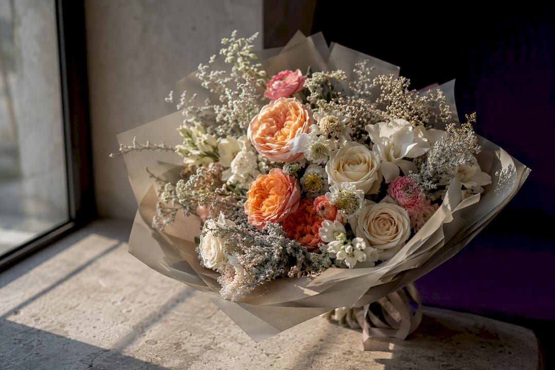
The simplest ratio to remember is roughly 70/30. Let neutrals (ivory, sage, taupe, dusty gray) or muted tints cover about 70% of the arrangement’s visual space, and reserve full saturation for the remaining 30% where you want the eye to land. A bouquet of blush garden roses with three or four saturated ruby ranunculus tucked in the center reads as intentional. The same bouquet with ruby, hot pink, and orange all fighting for space at equal volume reads as chaotic.
Neutrals do more than calm a bold palette down. They also extend the life of a design because ivory, cream, and sage tones are available across nearly every season, which means a vibrant seasonal color (say, a fall-only rust dahlia) can anchor a palette that otherwise stays flexible year-round.
Texture helps this balance land. A matte, dried element like wheat or dried grasses next to a glossy saturated petal creates visual separation even when the colors themselves are close in hue, and a slightly desaturated version of your accent color often works better as a bridge than a true neutral does. If a palette still feels too loud after adding neutrals, mute the accent itself rather than adding more neutral volume. It’s a smaller fix and it usually solves the problem faster.
What Flower Colors Symbolize Across Cultures
Color meaning shifts depending on context, but a few associations show up consistently enough to guide palette choices for specific occasions.
Red signals passion and romance in most Western contexts, which is why deep red palettes dominate anniversary and Valentine’s Day arrangements, but red also carries strong luck and prosperity associations in East Asian traditions, especially around Lunar New Year. White reads as purity and new beginnings at Western weddings, yet it carries mourning associations in parts of East Asia, so a florist filling a wedding order for a multicultural guest list will often ask about the couple’s background before defaulting to an all-white palette.
Yellow splits opinion. In most of the U.S. and Europe it signals friendship and cheerfulness, which is why sunflower-heavy palettes work for “get well” and “thinking of you” occasions. In some European funeral traditions, though, yellow carries a more somber association, so it’s worth checking regional context before sending yellow blooms to a sympathy arrangement.
Purple has carried associations with nobility and dignity since antiquity, tied historically to the rarity and expense of purple dye, and that legacy still shows up in how jewel-toned palettes read as more formal or luxurious than pastel ones. Pink softens almost every association attached to red, which is why blush and rose-toned palettes dominate baby showers, first anniversaries, and “just because” gifts where full romantic intensity would feel like too much.
None of this means a symbolic mismatch ruins an arrangement. It means that when you’re choosing between two otherwise-similar palettes for a specific occasion, the symbolic weight of the dominant color is a useful tiebreaker.
Adjusting Palettes for Indoor Light Versus Outdoor Light
The same palette can look completely different depending on where it sits, because artificial light and daylight render saturation and undertone in different ways. Warm-toned indoor bulbs push yellows and oranges even warmer and can flatten cooler blues and purples into gray, which is why a “cool romantic” palette that looks crisp in a shop can read muddier on a dinner table lit by warm bulbs.
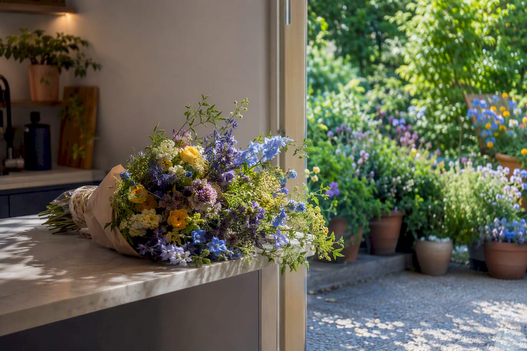
Outdoor daylight is more forgiving but introduces its own variable: direct midday sun bleaches out pale pastels and washes out subtle value differences, while overcast light (the kind most garden photographers actually prefer) saturates colors and makes even soft palettes look richer than they will in bright sun. Professional designers account for this by testing under the intended light before committing to a large order. Color-method guides for floral designers describe photographing small sample groupings under daylight, reception lighting, or studio lighting to see how saturation and value actually read before scaling up.
A few adjustments help close the gap between how a palette looks on your phone and how it looks in the room:
- For warm indoor lighting: lean into cooler support tones than you think you need, since the ambient light will warm them naturally.
- For bright outdoor sun: choose slightly more saturated flowers than a shaded reference photo suggests, since sunlight will lighten them.
- For evening events: avoid palettes that depend on subtle value differences, since low light flattens nuance and any pale pastel starts to look the same.
If you’re planning a retail-style wrapped bouquet for gifting rather than a fixed display, styling references like wrapped bouquet presentation examples show how the same palette reads once it’s bundled and photographed for handoff, which is a useful check before you finalize colors for a gift.
Why Most Palette Advice Skips the Hard Part
Most flower color content stops at the color wheel. It shows you complementary and analogous pairs and calls it done, but the wheel only tells you which hues get along. It says nothing about whether a rose in that hue is actually in season, whether the greenery you pick will fight the palette’s temperature, or whether the arrangement will look completely different once it moves from a shop’s cool white lighting to a warm dining room.
The conventional advice also overrates picking a “favorite color” as a starting point. A palette built around one beloved shade with no plan for support tones or foliage almost always ends up either flat (if it stays monochrome) or chaotic (if two or three more colors get added with no framework). The florists who consistently produce cohesive work start from context, season, occasion, light, then work backward to color, not the other way around.
If there’s one thing worth prioritizing above the rest, it’s the foliage undertone check. Readers fixate on flower color and treat greenery as an afterthought, but a blue-green eucalyptus dropped into a warm sunset palette does more damage than almost any flower mismatch, because greenery covers so much of an arrangement’s visual area. Get the greenery temperature right first, and most flower color pairings become far more forgiving than the color wheel alone suggests.
— Reza
Order a Custom Palette Instead of Guessing Alone
Building the perfect palette from scratch takes trial, error, and a lot of trips to a flower market. Malikflowers skips that entire process for you, handcrafting custom arrangements across Metro Vancouver built around the exact palette you describe, whether that’s a jewel-toned centerpiece or a blush-and-sage spring bouquet.
Every order comes with same-day delivery availability and a satisfaction guarantee: if the finished design doesn’t match what you had in mind, Malikflowers offers a refund. That’s a different kind of assurance than a standard flower shop gives, and it matters most when you’re trying a specific color combination for the first time. The signature collections already reflect several of the palettes covered above: Whispers of Spring for the blush-and-lilac look, Ruby Romance for deep jewel reds, and Autumn Glow for warm terracotta and burgundy tones.
Browse the full product catalog to see these palettes applied, check the spring collection for pastel-forward options, or start a wedding flower order if you’re building a palette around a venue or dress color. For recurring color-matched deliveries, the subscription option keeps a chosen palette coming on a schedule instead of a one-time order.
Sources
- Horticultural Science study on container color preferences
- The essential color wheel for florists — FloristsReview
- Diving into the flower color wheel — TeamFlower
- Wedding bouquet colors: how to build the perfect palette — The Evore
FAQ
What Flower Colors Go Well Together?
Complementary pairs (purple and yellow, red and green) and analogous groups (pink, coral, and orange) go together most reliably, especially when one color dominates and the others act as support.
What Color Palettes Are Available for Flowers?
Palettes typically fall into four categories: complementary, analogous, monochromatic, and triadic, then get organized further by season, such as spring pastels, summer brights, autumn warm tones, and winter jewel colors.
What Are the 12 Color Palettes?
There’s no single fixed list of 12 flower color palettes; most florists work from seasonal groupings like the 18 named in this guide, choosing whichever set matches the occasion, season, and lighting.
What Are the Best Colors for Flowers?
The best colors depend on the occasion and setting, but complementary combinations tend to test best with viewers, and researchers found they carried a $13 perceived-value premium in one horticulture study over randomly paired colors.